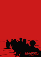
Opening Title sequences set the mood of an entire movie. With my personal project, I'll replicate styles used by graphic artists in films (mainly focused on war films.) And also study some of the artists creating these pieces that can draw people in or out of a feature film.
Dunkirk (2017) Directed by Christopher Nolan


In May 1940, Germany advanced into France, trapping Allied troops on the beaches of Dunkirk. Under air and ground cover from British and French forces, troops were slowly and methodically evacuated from the beach using every serviceable naval and civilian vessel that could be found. At the end of this heroic mission, 330,000 French, British, Belgian and Dutch soldiers were safely evacuated.
The graphic designer for the title is unknown (cannot seem to find them) but none the less, the opening title for Dunkirk tells a story. In my version (above to the left) I used the font style Franklin Gothic Heavy and overlayed a layer of the sea within it. With this simple text on a black background, we still get the sense of the movie and where it takes place. The sea divides these men from freedom, being a major role in the film and in history.
Fury (2014) Directed by David Ayer
Designer: Amanda Koh

In April 1945, the Allies are making their final push in the European theater. A battle-hardened Army sergeant named Don "Wardaddy" Collier (Brad Pitt), leading a Sherman tank and a five-man crew, undertakes a deadly mission behind enemy lines. Hopelessly outnumbered, outgunned and saddled with an inexperienced soldier (Logan Lerman) in their midst, Wardaddy and his men face overwhelming odds as they move to strike at the heart of Nazi Germany.
The blood-red sequence at the tail-end of Fury, David Ayer’s 2014 war potboiler, offers a brief respite from the gruesome bloodletting before plunging back into the fray. The film eschews an opening title sequence in favour of the one-two punch of a simple title card at the fore and an evocative main title sequence at the close. (mine above)
title references: http://www.artofthetitle.com/
steps for Dunkirk image
1.) Open photoshop
2. ) create a 2622 x 1212 black image/canvas
3.) Place your text with the 'Franklin Gothic Heavy' style and space each letter in between with 4 spaces.
4.) Drag an image of a beach into the same window (make sure the layer of the beach is above the text layer)
5.) right click the beach image and choose the option 'create clipping mask' and move the image to your desired area so the beach and ocean are
half way in between the text.
6.) go to 'adjustments' and click 'levels' depending on your preference, you can change it to what you like. I set mine to 66 , 0.80 , 255.
7.) you're done!
steps for Fury image
1.) Open photoshop
2.) create a 2622 x 1212 image/canvas
3.) drag a photo of a WW2 image to the blank canvas and adjust it so it fits the dimensions of the background.
4.) create a 'gradient map' layer above the image, make sure black is to the left and red is set to the right (#ff0909) I also blurred the image using motion blur and added a second gradient on top to darken the already existing one.
5.) Add your text with a 'Franklin Gothic Heavy' style (size 100) with a drop shadow
6.) drag a second WW2 image above the text layer
7.) right click the image and select 'create clipping mask' and move the image to your desired placement.
8.) add a second 'gradient map' and right click to create another 'clipping mask'
9.) go to 'adjustments' and choose brightness/contrast and lighten the image font (brightness = 150 and contrast = -36)
10.) You're done!


Movie posters replicating Saul Bass


Saul Bass worked on many movie posters and designs for directors in the early stages of film ( 50s, 60s ) he used bright colours for a background and usually a black silhouette subject to counteract the brightness. He uses sharp/uneven lines to outline his subjects an gives little detail to viewers.
Comments
Post a Comment